Small Color Inventory and Classification
Perceived colors are therefore blends of monochromatic* light rays. Let’s see how to classify all these colors and how they are decomposed.
Note
We are still talking here about light and light rays, and thus about an additive synthesis; it is not about the composition of surfaces and the way they absorb and reflect colors, and which would be the object of a subtractive synthesis of light.
See chapter Theory/Color Reproduction for more details on the subject.
Black
The simplest color is therefore black*: total absence of light is perceived as black. When the light intensity decreases, colors gradually approach black. But when the intensity rises, colors don’t whiten! The higher the intensity, the more the color appears “bright” and “saturated”, but doesn’t fade, doesn’t whiten 1.
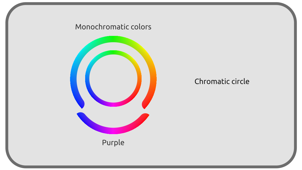
Monochromatic lights
The simplest colors, and the rarest (they’re those emitted by Lasers for example), are those composed of a single monochromatic light. They’re in fact the colors of the rainbow, those which are included in the monochromatic spectrum.

They range from red to blue, through orange, yellow, green, cyan… but don’t include any shades of purple*.

They can vary in intensity, in a scale from black (null intensity) to the “brightest” color.
Purple
It should be noted that the purple/violet range2 isn’t part of the “natural” and monochromatic colors but is the result of the blend of blue and red rays, which are the two extremes of the spectrum.

Purples added to the monochromatic colors form the set of the most saturated* colors, which are therefore all monochromatic colors and blends containing only blue and red.
White and Grey
In nature, all lights, or more precisely all light rays, are monochromatic*; it’s the perception of their blending that’s interpreted by the brain as an infinity of other colors. We saw that purples are part of these blends; all the other colors which aren’t saturated*, grays and whites, are therefore also mixed lights.
All “desaturated” shades, whites, grays, are blends of these monochromatic colors, and there is for each color (and not only grays, all non-monochromatic colors) an infinity of different blends which can generate it.

Two colors perceived in an identical way but composed of monochromatic rays in different proportions are said metamers*.
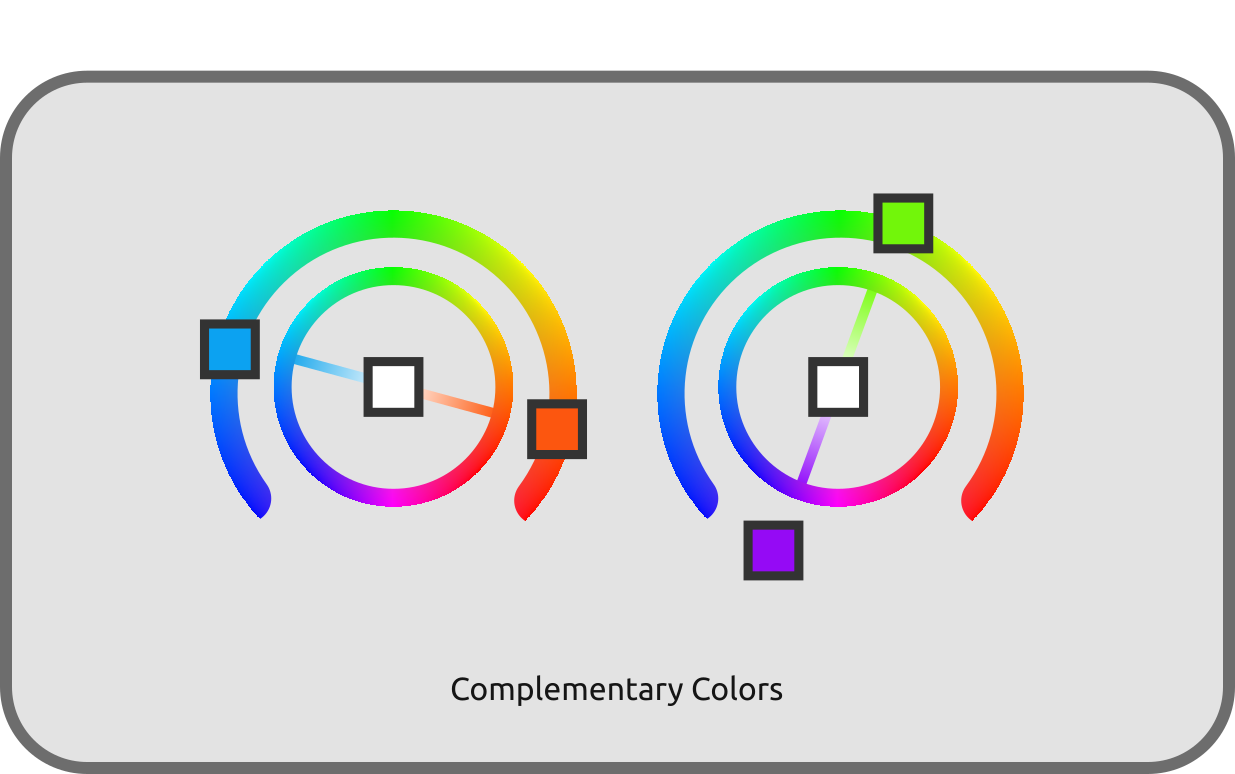
Complementary colors
A minimum of two “opposite” rays is needed to form white: two monochromatic rays that form grey/white when they’re blended are said to be complementary*.
Purples can also be considered complementary to greens. Indeed, a purple blended with green becomes white3, and can therefore be considered as the complementary of green4, although it’s actually already the combination of red and blue. These green, red and blue are the three common primaries of digital color reproduction systems.
Perception
The same white sheet of paper will be seen as white regardless of the time of day or the type of lighting, although in reality its color is quite different in each of these cases: the sheet of paper will in fact take on the color of the light that illuminates it, but the brain will operate a “shift” in perception that will make it appear white in all cases.

Under the sun, in the shade or surrounded by the clouds, whatever the time of day, we perceive snow as white even if in reality the light it reflects is always time different5.
different sets of light rays, with completely different physical attributes, can be seen the same way by a single observer. The perception of colors is eminently subjective.
-
In the real world. But artistically, the technical limits of color reproduction systems impose to “cheat” by whitening highlights to compensate the luminosity limit of available colors. Without this trick, “monochromatic” colors in an image could appear less bright than grays or whites in the same image; lights are therefore “pulled” towards white values to compensate. ↩
-
The term “ultraviolet” used to describe the part of the electromagnetic spectrum beyond blue is misleading; the end of the spectrum is perceived as (dark) blue rather than violet. True violet is the color that we perceive as a result of the combination of blue and red rays. ↩
-
We are of course speaking here of light, in other words an “additive” synthesis where the intensities add up. This is obviously not true in painting and printing which are “subtractive” systems where colors “asborb” light intensity, subtracting rays of light. cf. chapter Color Reproduction. ↩
-
If we wanted to be physically correct, the greens would simply have no complementary colors at all, and only the intervals of rays near the two extremes of the spectrum (oranges-reds and cyan-blues) would be complementary to each other. ↩
-
Which a camera has the greatest difficulty to reproduce. see chapter About white values: temperature. ↩